Paul Tran - Wivvi
Wivvi: Project Visualization Tool
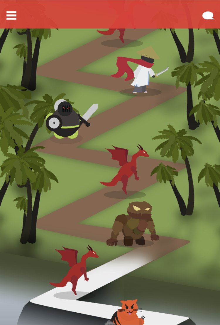
A collaborative and organizational app that turns tasks and schedules into a path enemies to be "conquered". Intended for both personal planning and group project visualization.
user research, persona/storyboarding, wireframing, prototyping, usability testing, a/b testing
Discover
Design Challenge
We were tasked with producing an application which would facilitate information exchange between users. The tool should draw upon use-cases and functionalities of existing platforms, but ultimately attempt to fill an underexplored niche. The team consisted of developer Christopher Jordan with Kent Tsang and myself as graphic and UX designers. My role as a designer was ensure that our ideas were clearly communicated to users. This involved user research, low - high fidelity wireframes, prototyping, and facilitating usability and A/B testing to ensure smooth user-flows.Research
We began exploring the problem by collecting data through observational studies and surveys conducted on students with the goal of discerning:- Popularly utilized information exchange tools
- Common reasons for tool usage
- User issues with existing tools
- Unexplored design space
Define
Point of View
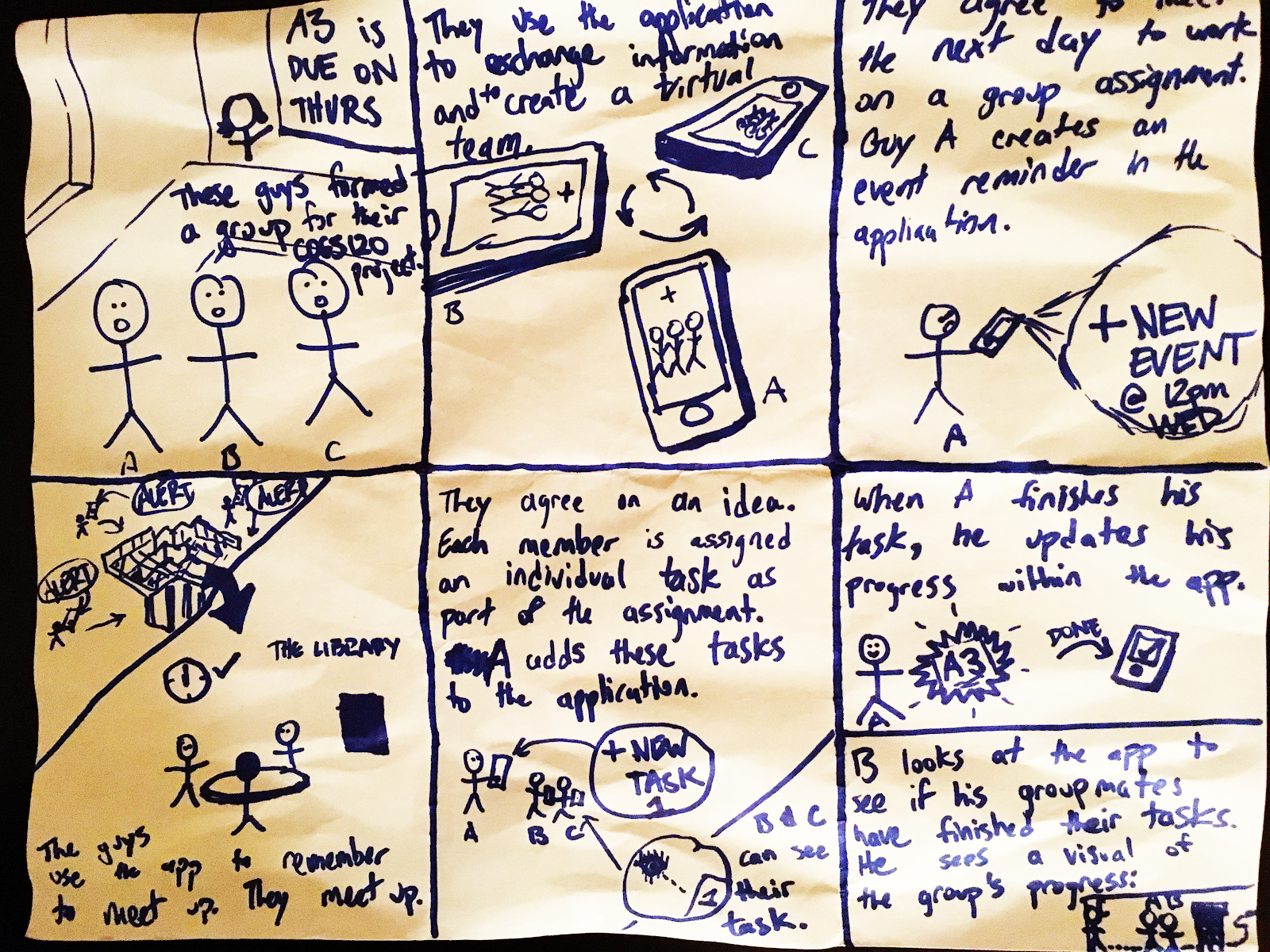
Persona & Storyboarding
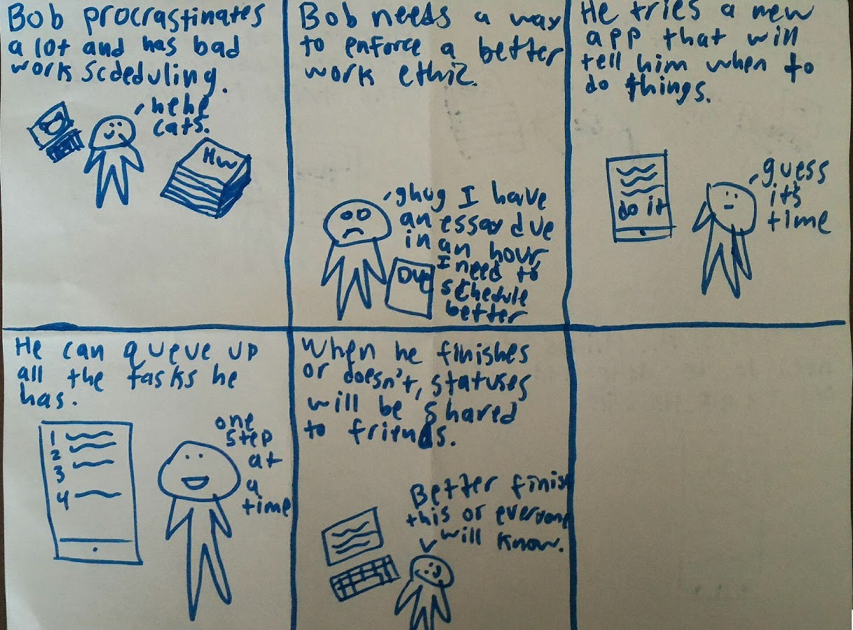
To better understand the user we worked on turning our research results into three distinct personas. The first is a young professional managing a project for his company. The second is a college student with bad work ethic and scheduling. The third is a project group for a school assignment. Using these personas we began storyboarding for a tool that would fulfill user needs.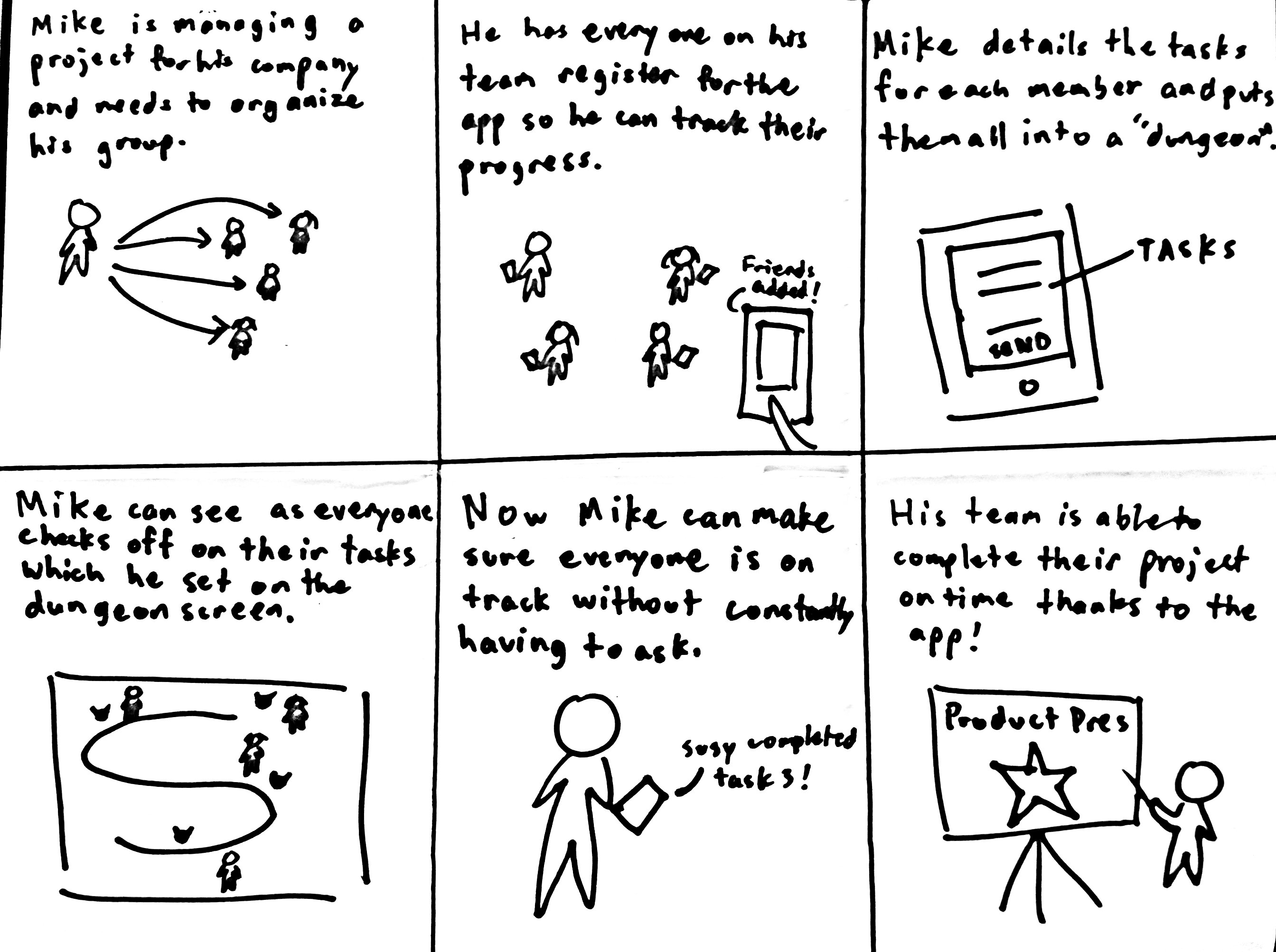
develop
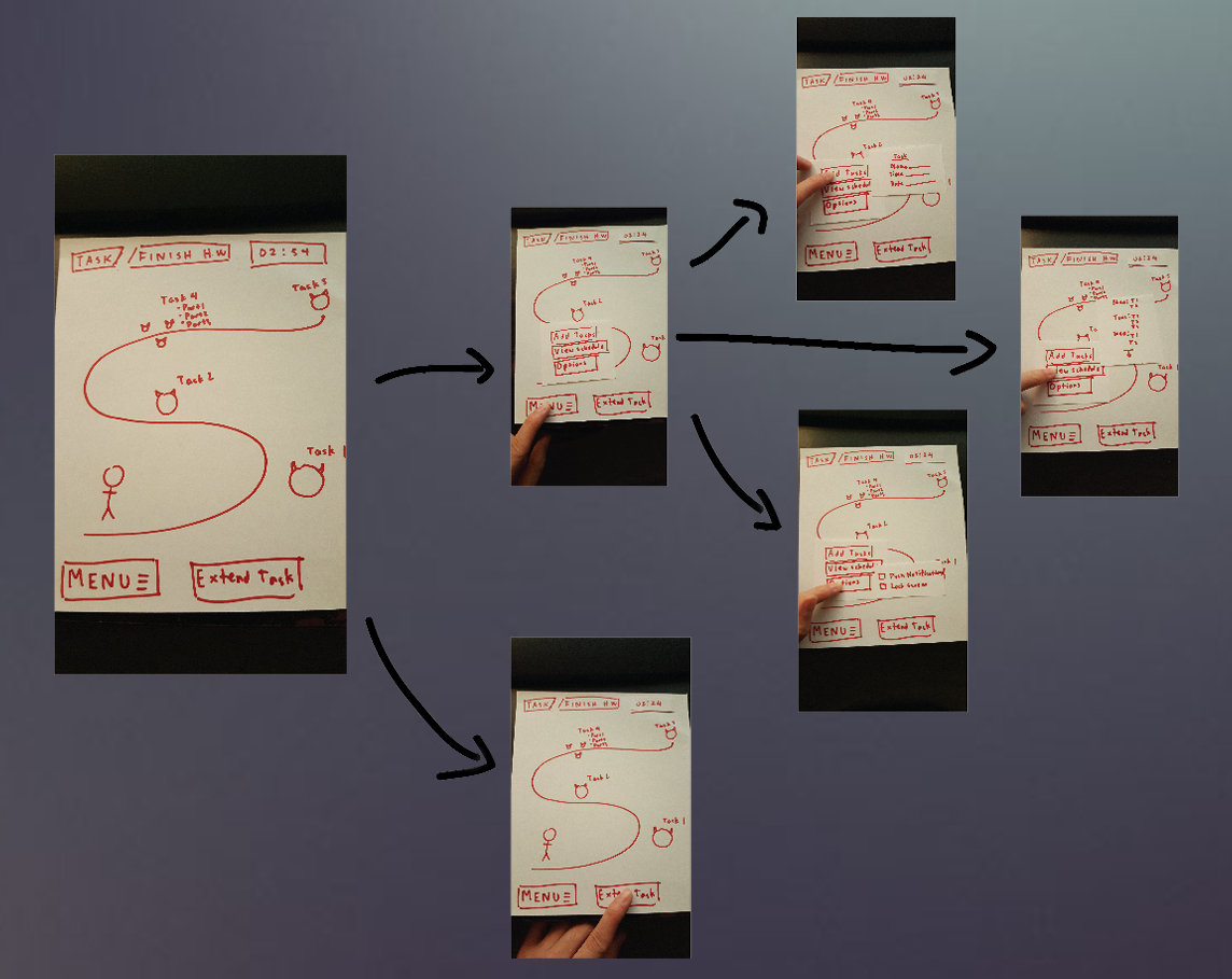
Paper Prototyping
In order to begin developing a workflow we created paper prototypes as a non-intensive way to iterate upon our ideas.
Prototype 1
Prototype 2
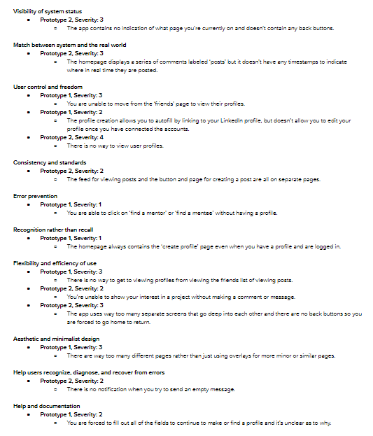
Early Heuristic Violations
We tested our paper prototypes for violations of Jakob Nielson's design heuristics so that we could improve upon the workflows in our wireframes.
Wireframes
Usability Testing
High Fidelity Prototype
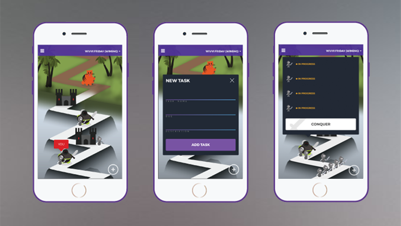
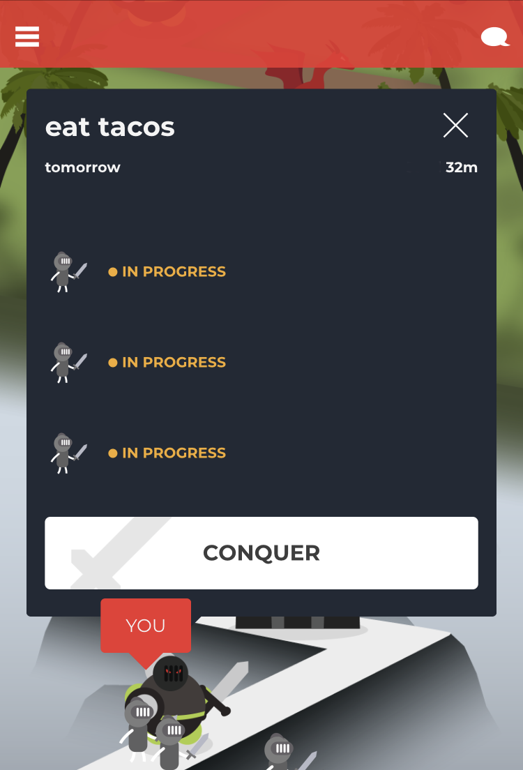
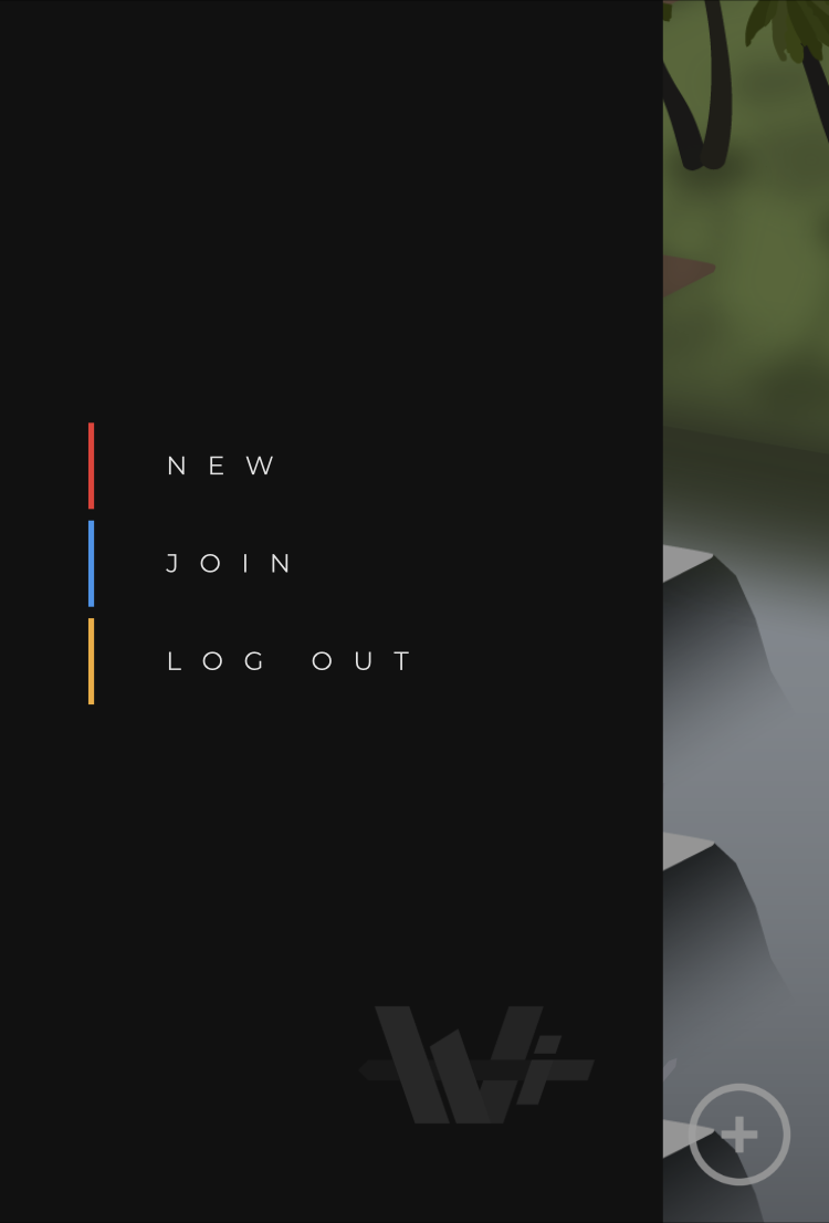
Application has main functionality. Users can make accounts, login, create an adventure, join an adventure, create tasks, edit tasks, update adventure progress. Main page allows for users to view group status and group info. Users can also access a mock up of basic user profile functions.
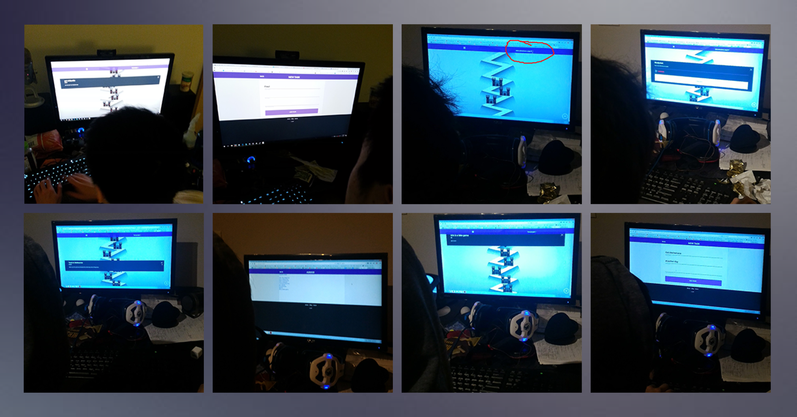
Execution
During the test, a note taker will be observing as the user is testing the application and thinking out loud throughout the process. Notable observations will be written down and pictures will be taken. A video recording of the test will be done if the tester consents. The tasks the tester are requested to finish are core functions of the web app and need to be tested for how intuitive and understandable they are. Things to be noted are hesitation, mistakes, and slip ups which would be good clues to fixing any intuition gaps in the UI.
User Tasks
- Explore the home page and answer “What is the objective of the people participating in the Test Project adventure?”
- Find the 'all adventures' tab and select 'test project'. What do you think the 6 letters on the top do and/or mean? Report your idea to the facilitator at the end.
- Logout, create an account and make an adventure with at least three tasks.
Results
From these trials of user testing, we’ve discovered a few bugs and changes we need to make. Some of the bugs we found:
Users are commonly mistaking the title for the adventure code and are not understanding the consequences of the “conquered” button as well. This is a violation of the user control and freedom heuristic and we plan to implement the following changes to mitigate:
These changes should bridge the gulfs of evaluation and execution, making it easier for the user join an existing group adventure and to understand what they can do with the app and where to find information.
A/B Testing
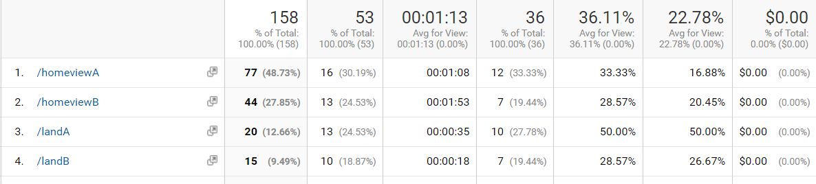
In version (A), the user can join an adventure without leaving the homepage (via the side menu). In version (B), the user must view the adventures screen where they must then select join adventure (leaving the homepage). These two navigation schemes are different by 2 screens, with (A) allowing the user to complete this operation without leaving the homepage. A google analytics page is set up for the /adv/ extension, to see how many users prefer the old navigational scheme (B) vs. (A). This is valid for a chi-squared distribution test because a hypothesis H can be formed, where H = “Most users will prefer scheme (A) to (B), and will not visit the /adv/ extension”. Chi-squared can be performed on the distribution of visits to A vs B, and the hypothesis can theoretically be proved null if (B) is preferable to (A), and not proved null otherwise. (A) may turn out to be a better scheme because users will require less clicks and page loads. (A) also provides easy access to the adventure code of the user’s current adventure. (B) may turn out to be a better scheme because user may prefer the control of seeing all adventures.
Chi Squared Analysis
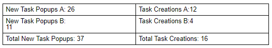
Expected Task Creation Rate A+B: 0.43243243243243 Expected Hidden Button Task Creations: 4.7567567567568 Expected Shown Button Task Creations: 11.243243243243 Chi squared: 0.17132867132867 P value: 0.32 Probability of a larger chi squared value: 68% Cannot reject Null hypothesis. Having the Task Creation Button hidden did not significantly affect the rate at which the Create Task Popup button was shown relative to the number of tasks created. The external validity is extremely low and as such this data cannot be generalized.
Deliver
Final Prototype
Further Testing
The Prototype
We created a highly functional prototype of the web app which you can access below.
Thoughts & Reflections
Through our design process we faced some problems with refining our design ideas especially early in the process. Our paper prototypes were overly complicated and ended up being confusing to navigate through for some people due to us attempting to mesh together some of our conflicting ideas. If we were to go through the process again we would go in with a more concrete plan of how to collect data and forumulate a design statement from it. This would allow the process of iteration to be more focused on which aspects we should be testing and how to use the data.